Though it hadn’t been touched much for two generations, it held a lot of emotion.” So says interior designer Jeremiah Brent, about an apartment in Manhattan that had been a Latin American family’s anchor for decades — home to its beloved matriarch; the site of memorable gatherings, convivial dinners, and celebrations of all kinds. Everybody knew that the Park Avenue property had to be renovated when it recently passed into another generation’s hands, but, the New York–based talent adds, the commission would prove a challenge for everyone involved, personally as well as professionally. “It couldn’t lose any of its spirit, but we had to bring in light and more contemporary elements,” he explains.
“The approach had to honor the client’s mother, who had lived there for so long, while bringing it into the present, while also leaving at room for the future.”
Park Avenue, New York
Located in a 1920s building on the city’s Upper East Side, the 2,600-square-foot flat is “so beautiful and grand and has such great soul,” Brent observes, adding that he had been recommended for the job by the owners’ nephew, who happens to be one of Brent’s clients. Of the uncle and aunt who have now become close Brent friends: “He is practical and logistical but has this funny art eye that gravitates to bold, emotional pieces. She’s as chic as it gets, seriously smart, and likes things that are refined, soft, and luxurious.”
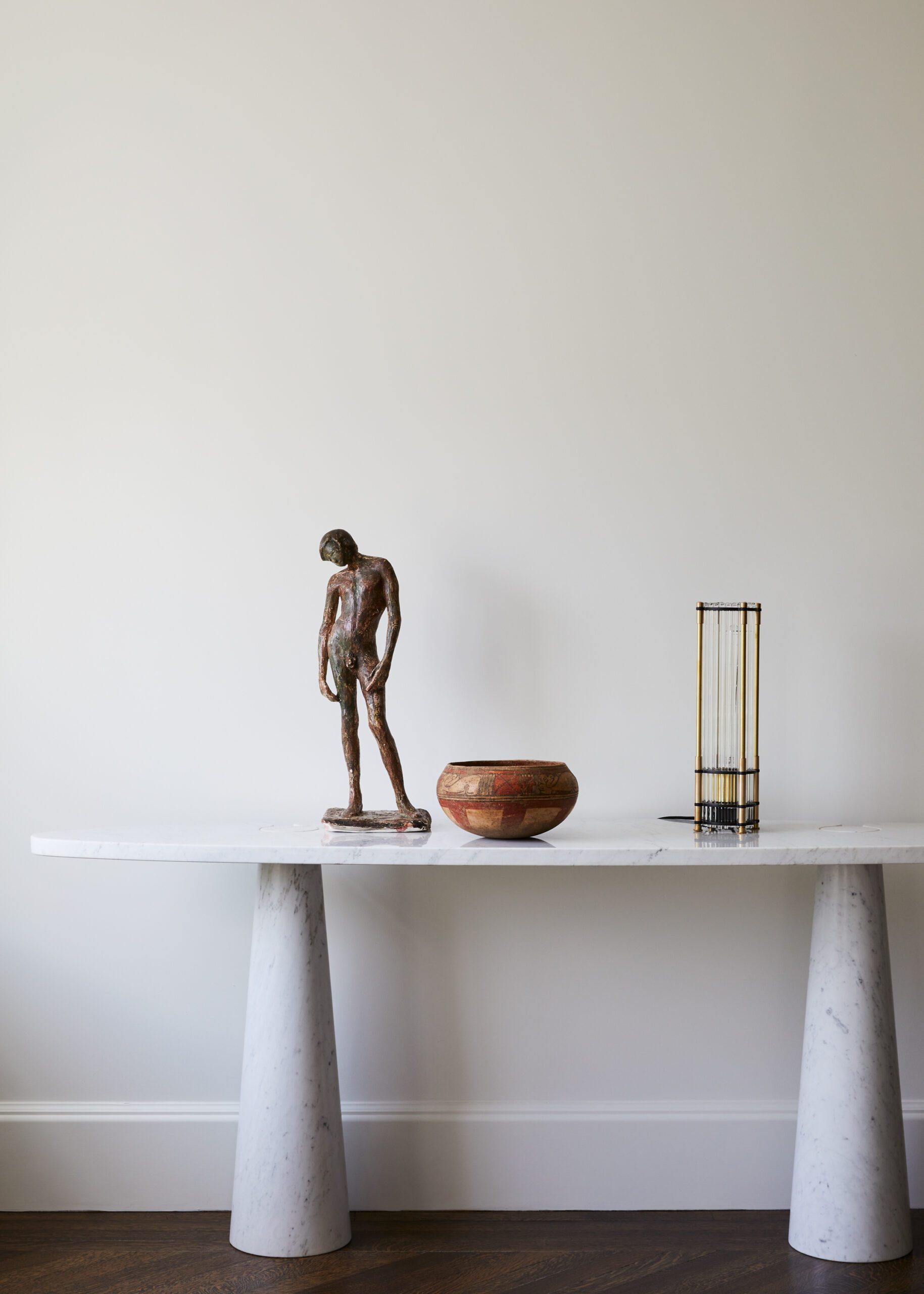
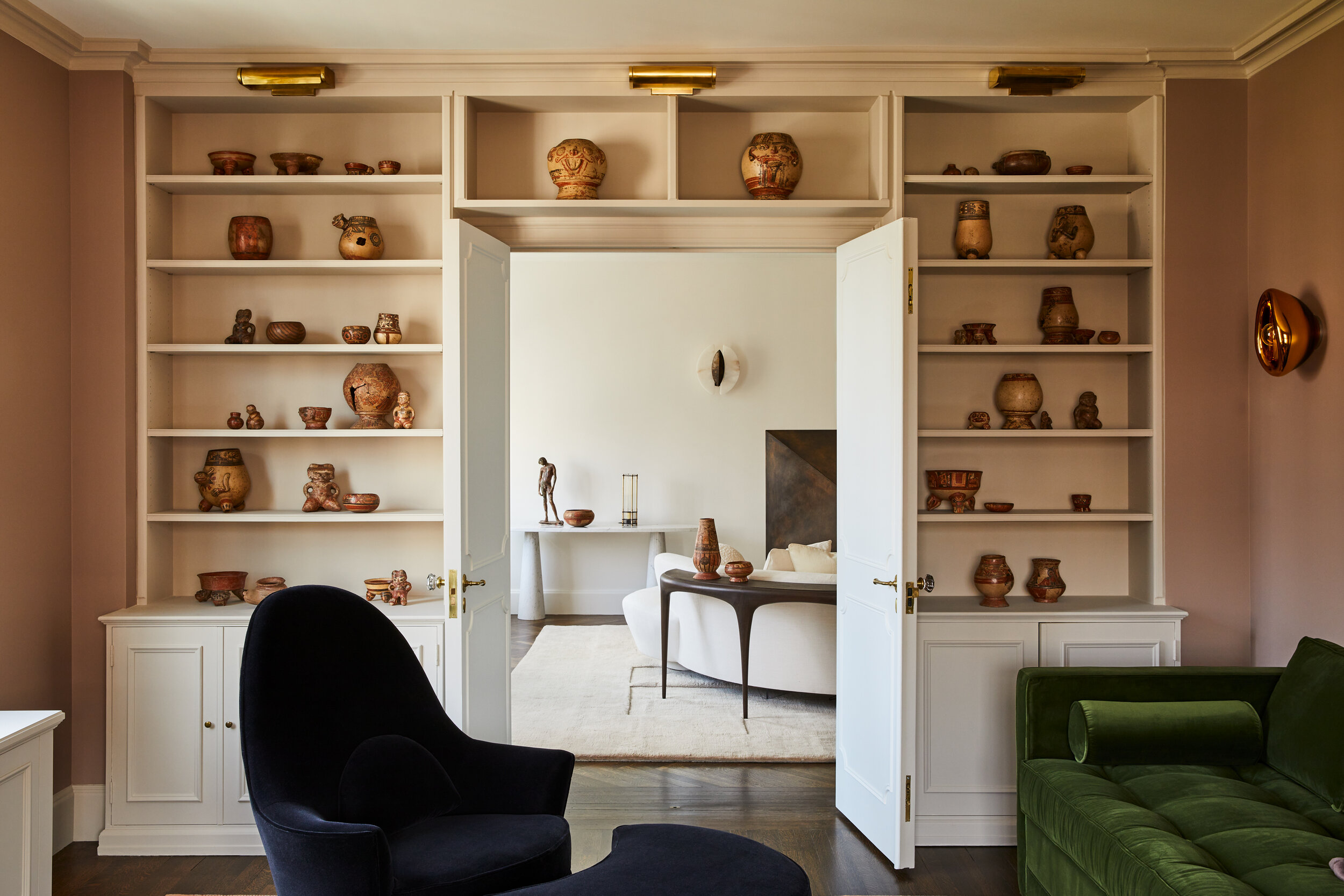
The couple are members of a worldly clan that shuttles between Mexico and Nicaragua and which has collected art in abundance and, indeed, produced it. “There were these bronze sculptures everywhere that looked like Giacomettis—but they were the work of the husband’s mother, who is now in her 90s,” the decorator says. He was also stunned by an accumulation of Mesoamerican pottery that had been collected over more than 30 years. “That’s where we started, pulling out patinas and finishes that reflected the pottery and the bronzes,” Brent says. “They had never really been showcased before.”
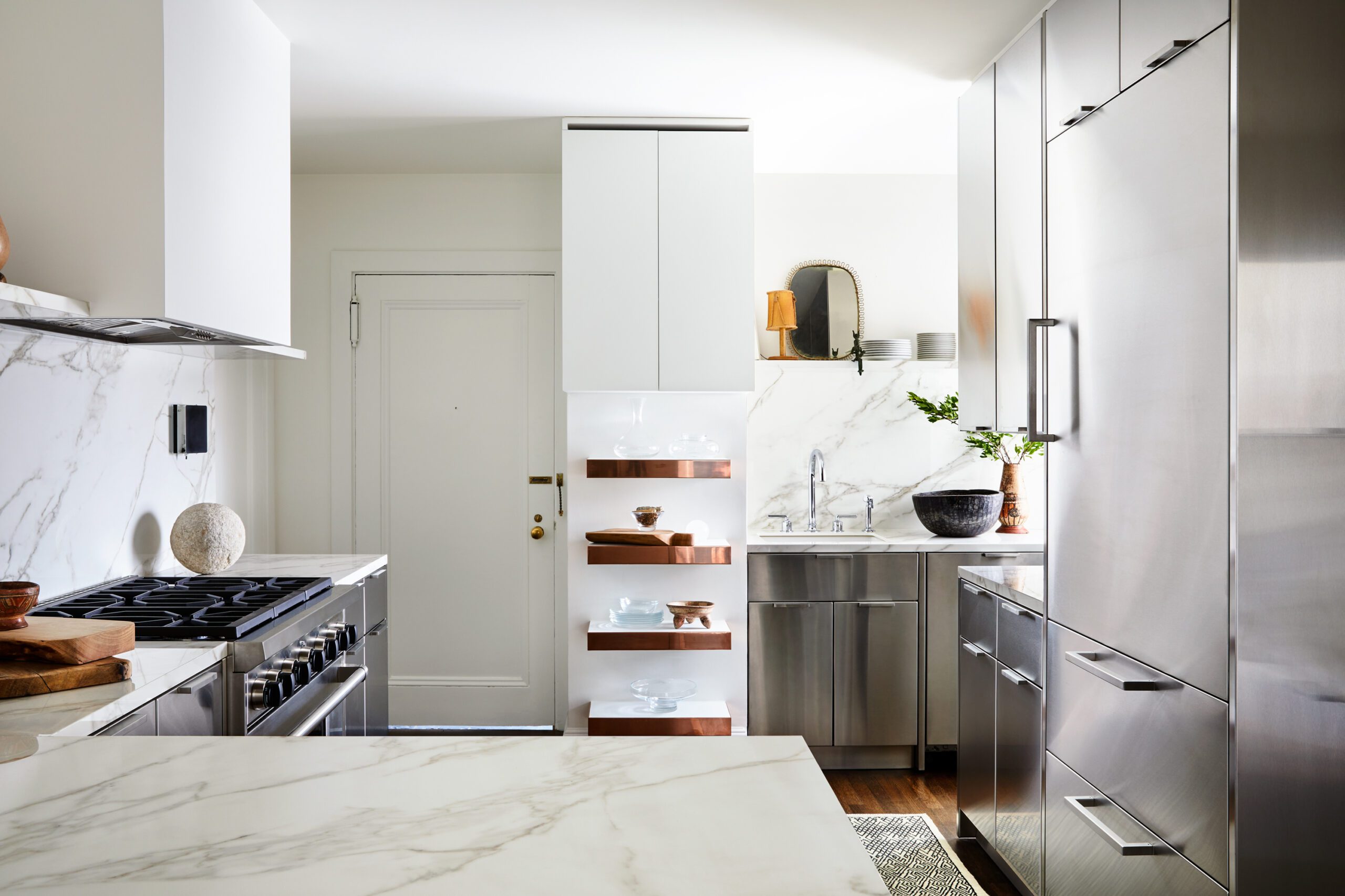
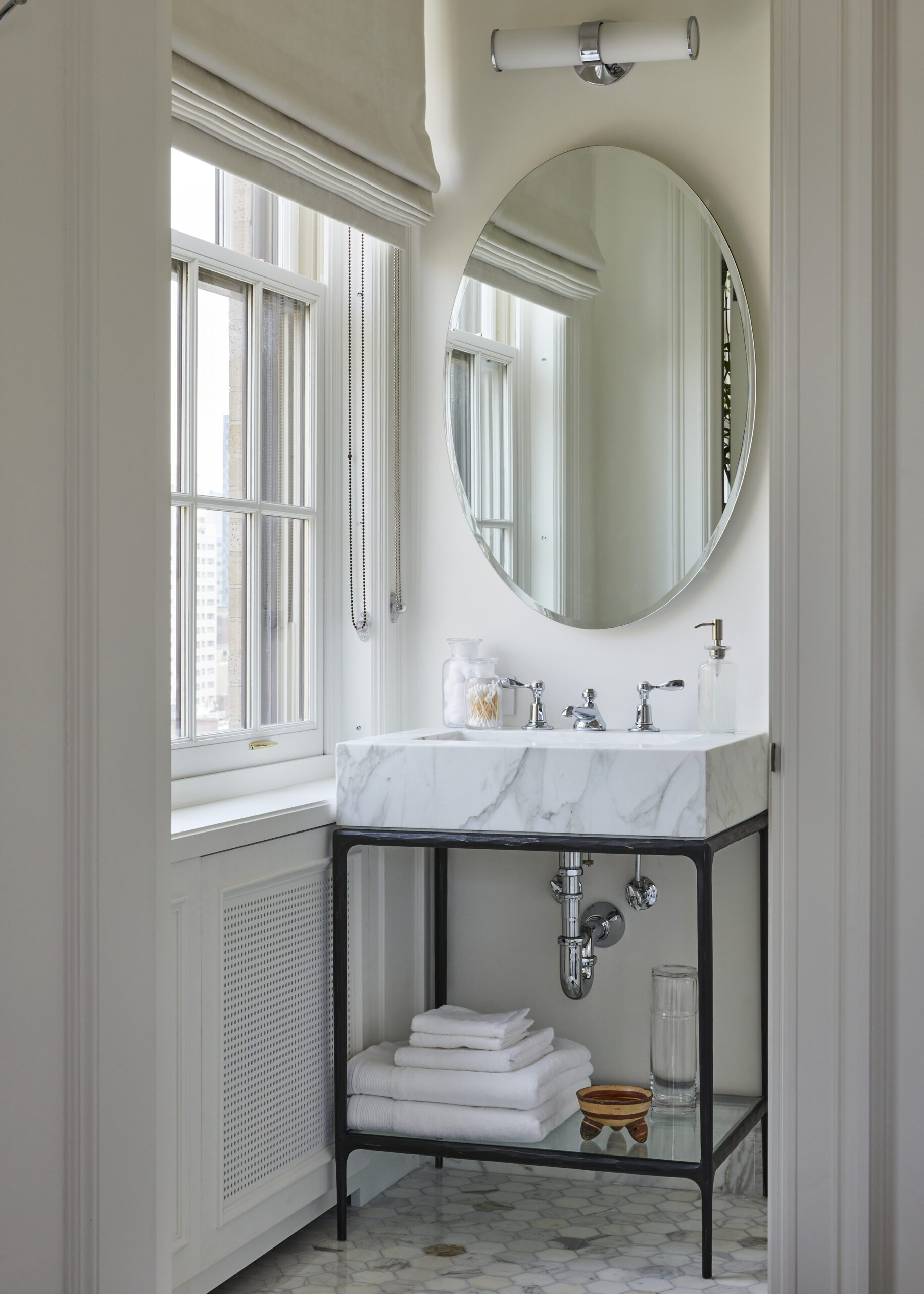
Kitchen Details
Before any work started—including revitalizing the baths and the kitchen, which needed to be updated—Brent proceeded as he always does, asking a question that provides a foundation of insights: “What are the three most important times of your day?” As he explains, “You learn a lot about somebody when they can tell you about the moments and ceremonies and rituals that ground them to a space. Sometimes people realize what they’re not getting out of their home, and that’s when the exercise gets really interesting.”
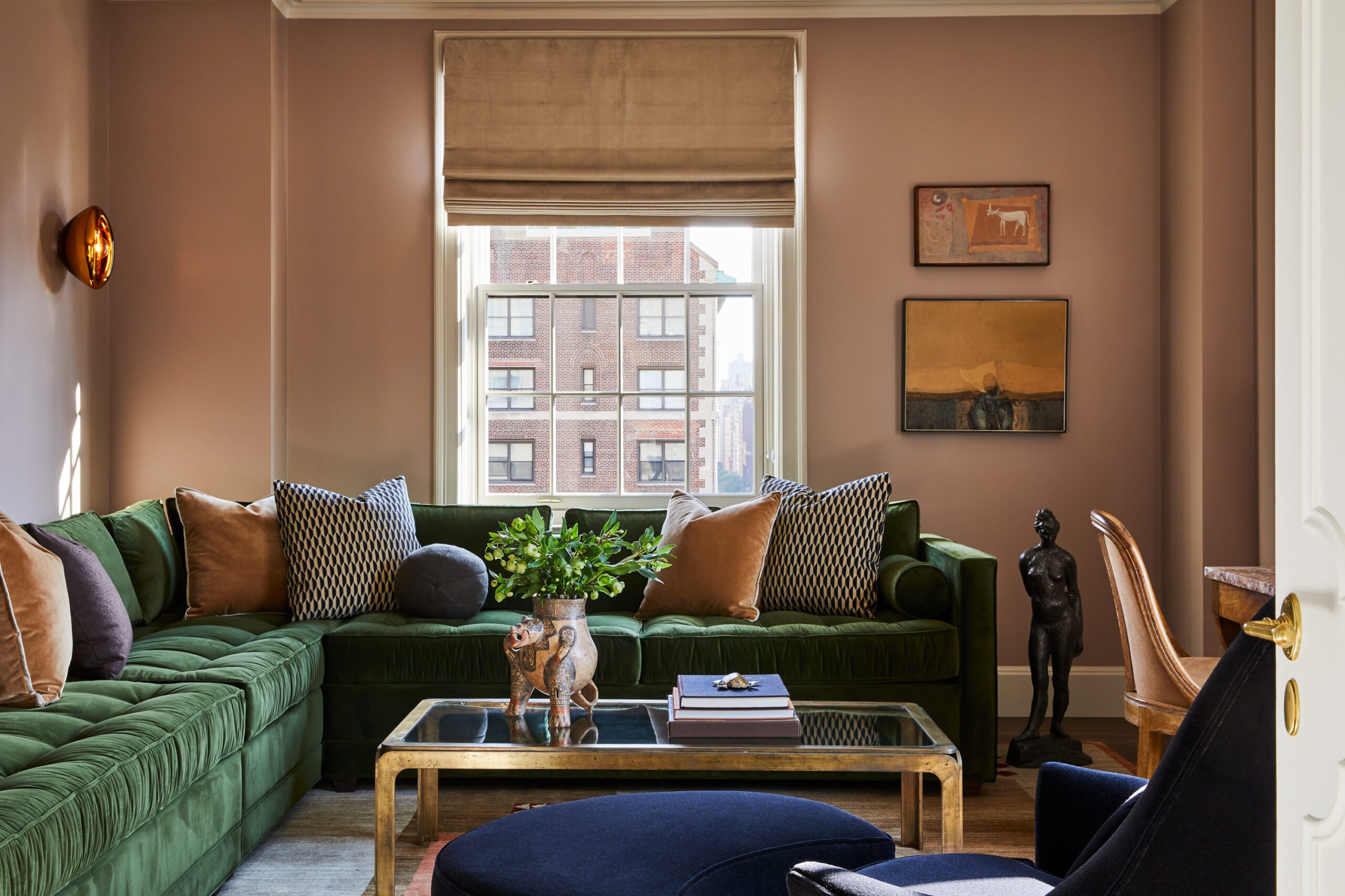
For the clients, one thing that was missing in the apartment was a place to quietly read a book and to write a letter. Luckily, adjacent to the living room was an ancillary space that proved to be a perfect spot for those two pursuits. Brent recast the space, painting the walls with Farrow & Ball’s Dead Salmon, a pinkish-beige tone that relates to the pottery vessels that are now grouped on the room’s built-in shelves, and installing a L-shape sofa upholstered in tufted olive green mohair velvet. A deep blue chair with a matching ottoman beckons for a relaxing read, while against one wall stands a marble-topped Charles X table accompanied by an elegant chair— both of which belonged to the client’s mother — the perfect spot to dash off a note.

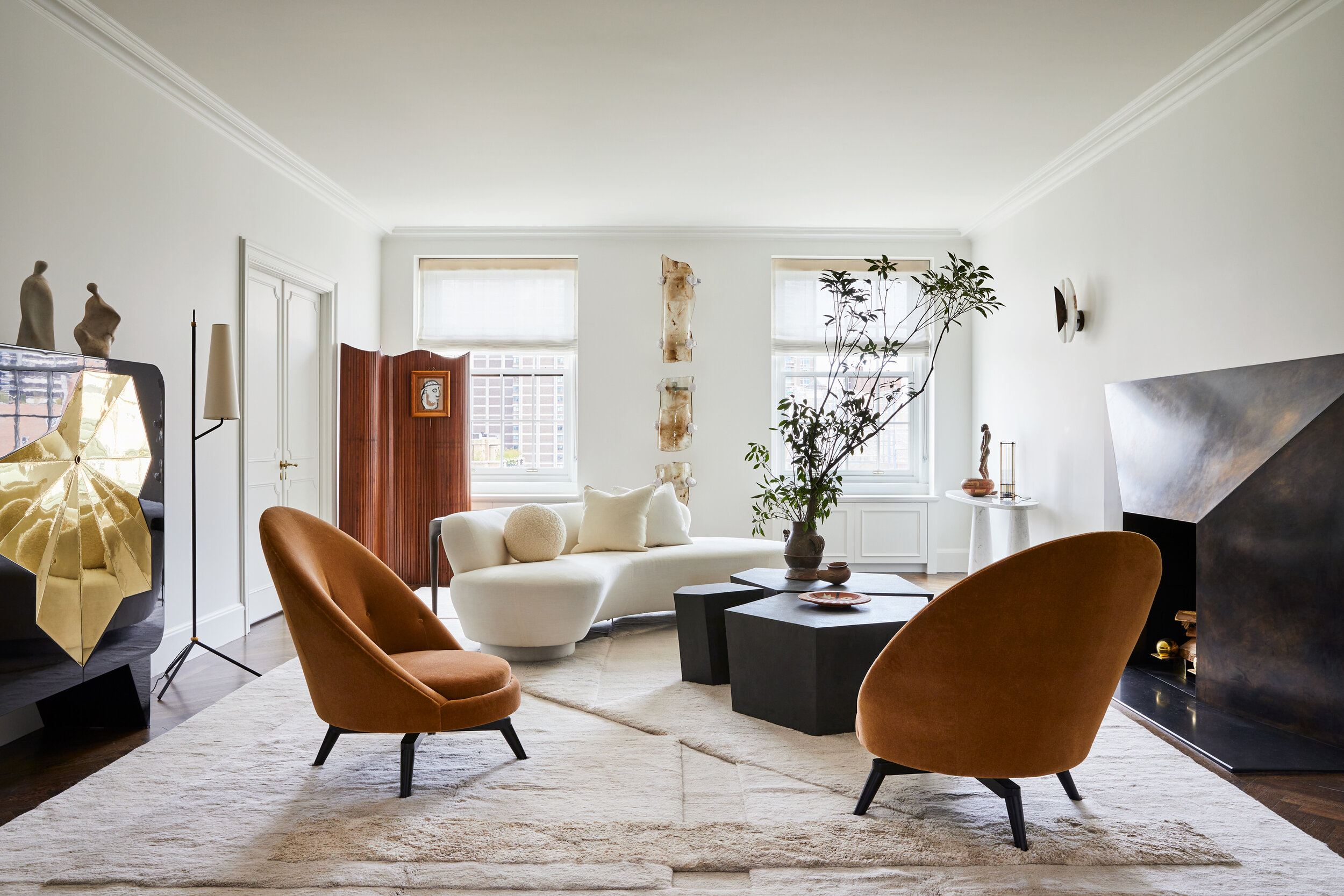
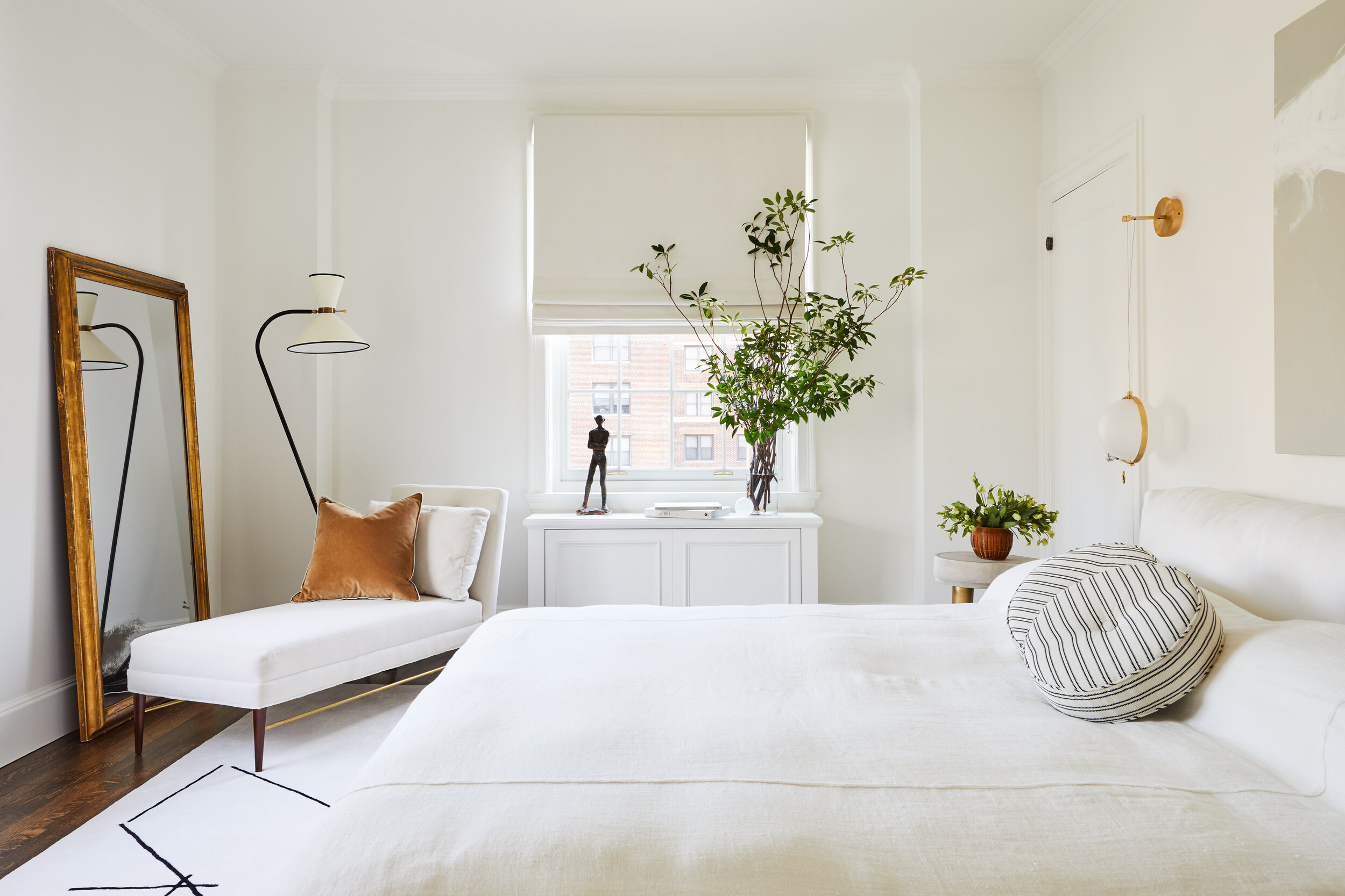
“That was the one room where we were going to play with color,” Brent says, “because I wanted the rest of the apartment to have a tight, more neutral palette.” By which he means largely soft-white walls, pale fabrics, molasses-dark wood floors, and uncomplicated window treatments that control sunlight without suppressing it, unlike the shutters and heavy curtains that reigned before.
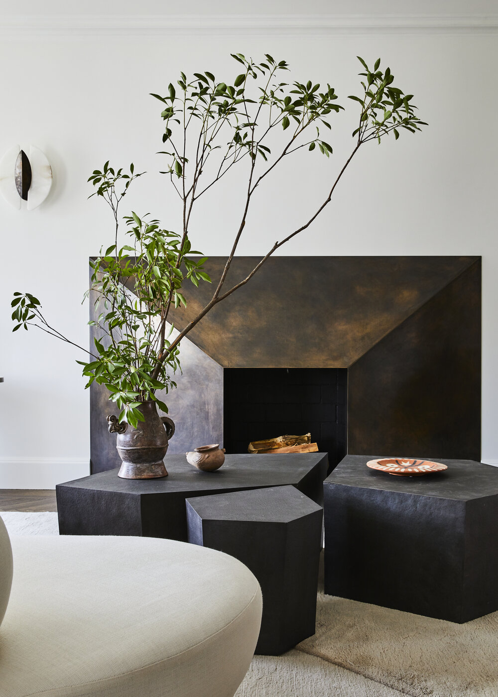
Neutral, yes, but not without moments of excitement, such as the boldly angular custom bronze mantel in the living room, its material chosen expressly because it related to the matriarch’s figural sculptures. It’s a fun-house repetition that energizes the classical architecture while the overlapping curves engender a strange sense of hypnotic calm. Complementary geometries can be found throughout the rooms, in furnishings large and small.
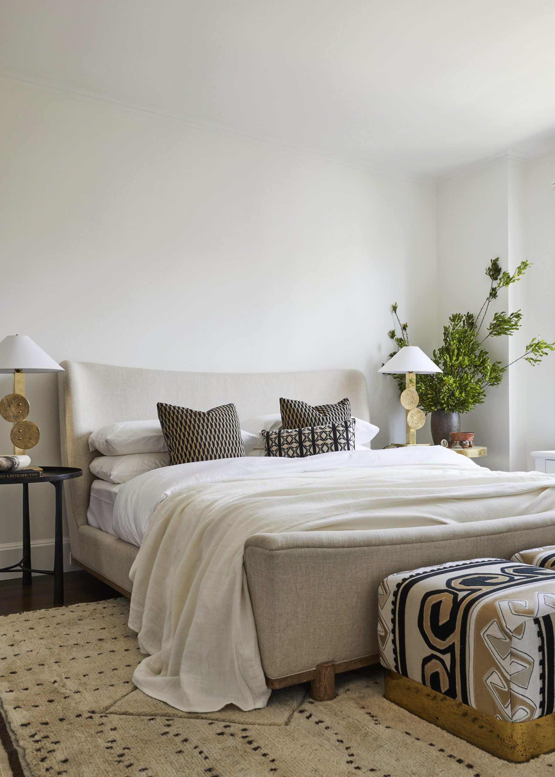
The Primary Bedroom
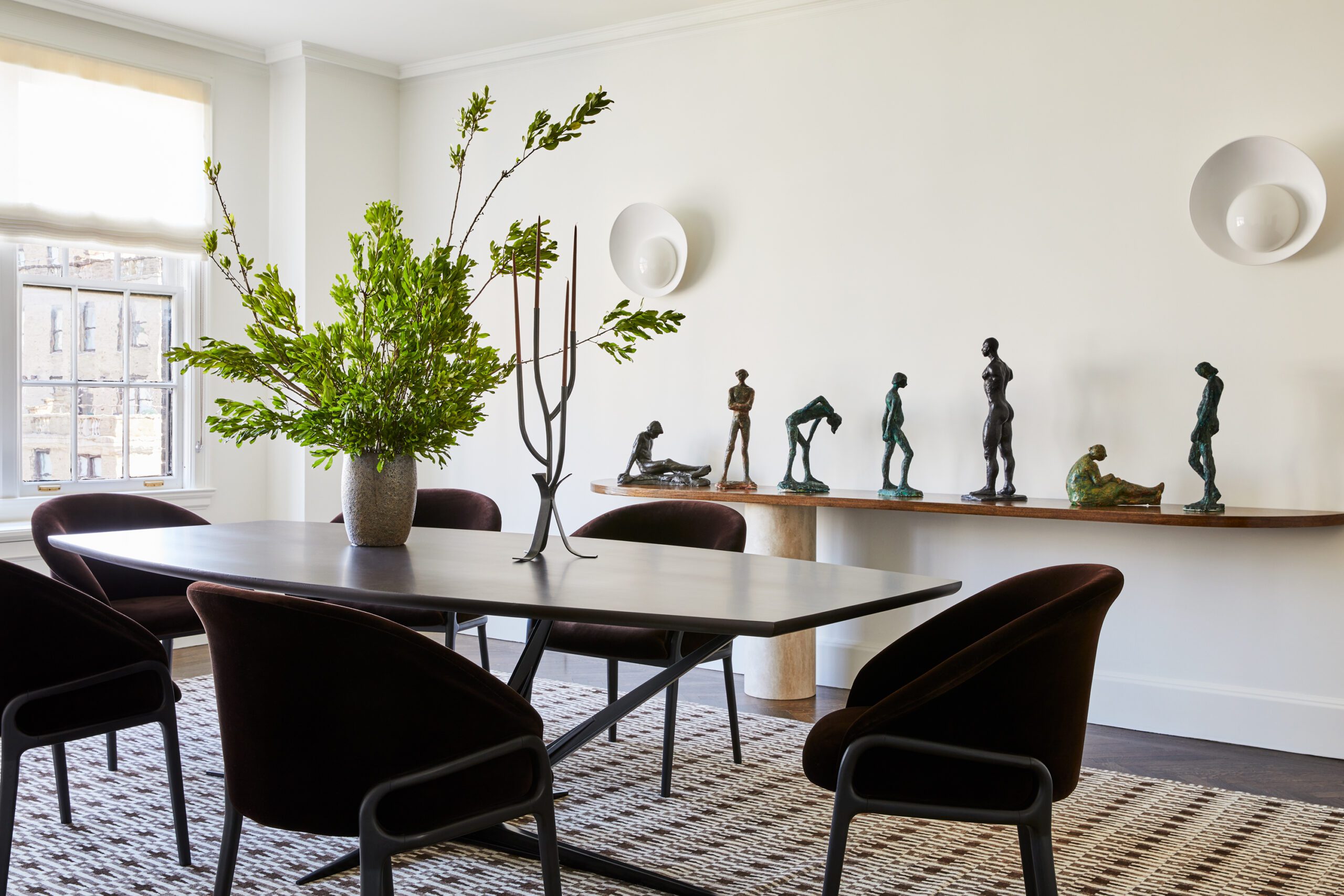
As Brent promised from the start, the matriarch’s figural sculptures are treated with the respect and importance that he felt they had long deserved. Formerly scattered here and there, most are now displayed on a custom-made travertine console in the dining room. Sitting, standing, bending, and walking, they make the sleek, serene space seem full of life when not a soul is around while also paying homage to the past. “Nothing is more luxurious than when you are brave enough to blend and to bring things together,” Brent says. “The most beautiful space is a blended one, that feels assembled and which represents different generations.”
“The most beautiful space is a blended one, that feels assembled and which represents different generations.”
